Ever stood in the paint aisle staring at two seemingly identical swatches, wondering if you’re losing your mind? That was me last month, frozen between Benjamin Moore’s Pale Oak and Revere Pewter. Both beautiful neutrals, but which one would actually work in my space?
I spent weeks testing these colors in different lighting, comparing undertones, and even polling friends who visited. The differences are subtle but significant, and choosing the wrong one could completely change your room’s vibe.
If you’re torn between these popular neutrals, I’ve done the legwork for you.
In this color analysis, I’ll break down exactly how these shades differ and help you decide which one belongs on your walls.
Understanding the Paint Colors
Before we jump into comparisons, let’s get to know each of these Benjamin Moore favorites on their own terms.
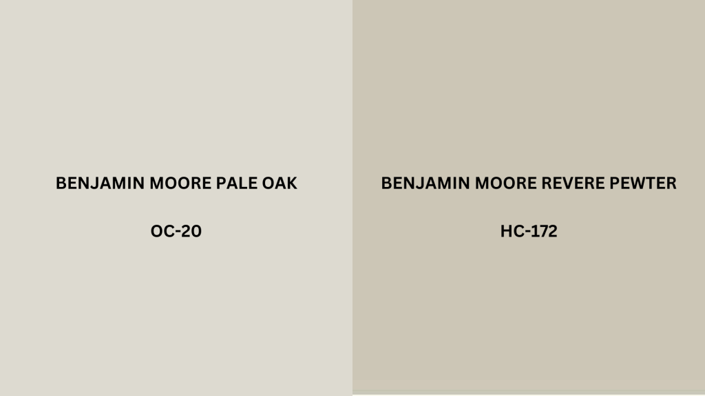
Pale Oak (OC-20)
Benjamin Moore’s Pale Oak (OC-20) is a soft, warm greige with subtle undertones that shift between beige and gray depending on lighting conditions. With an LRV (Light Reflectance Value) of 68.64, it’s a relatively light color that brightens spaces while maintaining depth.
Pale Oak features stylish taupe undertones with hints of green that emerge in certain lighting situations, particularly in north-facing rooms. Its warmth comes from beige influences that prevent it from feeling sterile or cold.
Revere Pewter (HC-172)
Benjamin Moore’s Revere Pewter (HC-172) is a medium-toned greige that leans more distinctly toward the gray end of the spectrum. With an LRV of 55.05, it’s significantly deeper than Pale Oak, absorbing more light and creating a more substantial presence on walls.
Revere Pewter contains warm undertones that prevent it from feeling cold, but its predominant gray characteristics give it a contemporary edge.
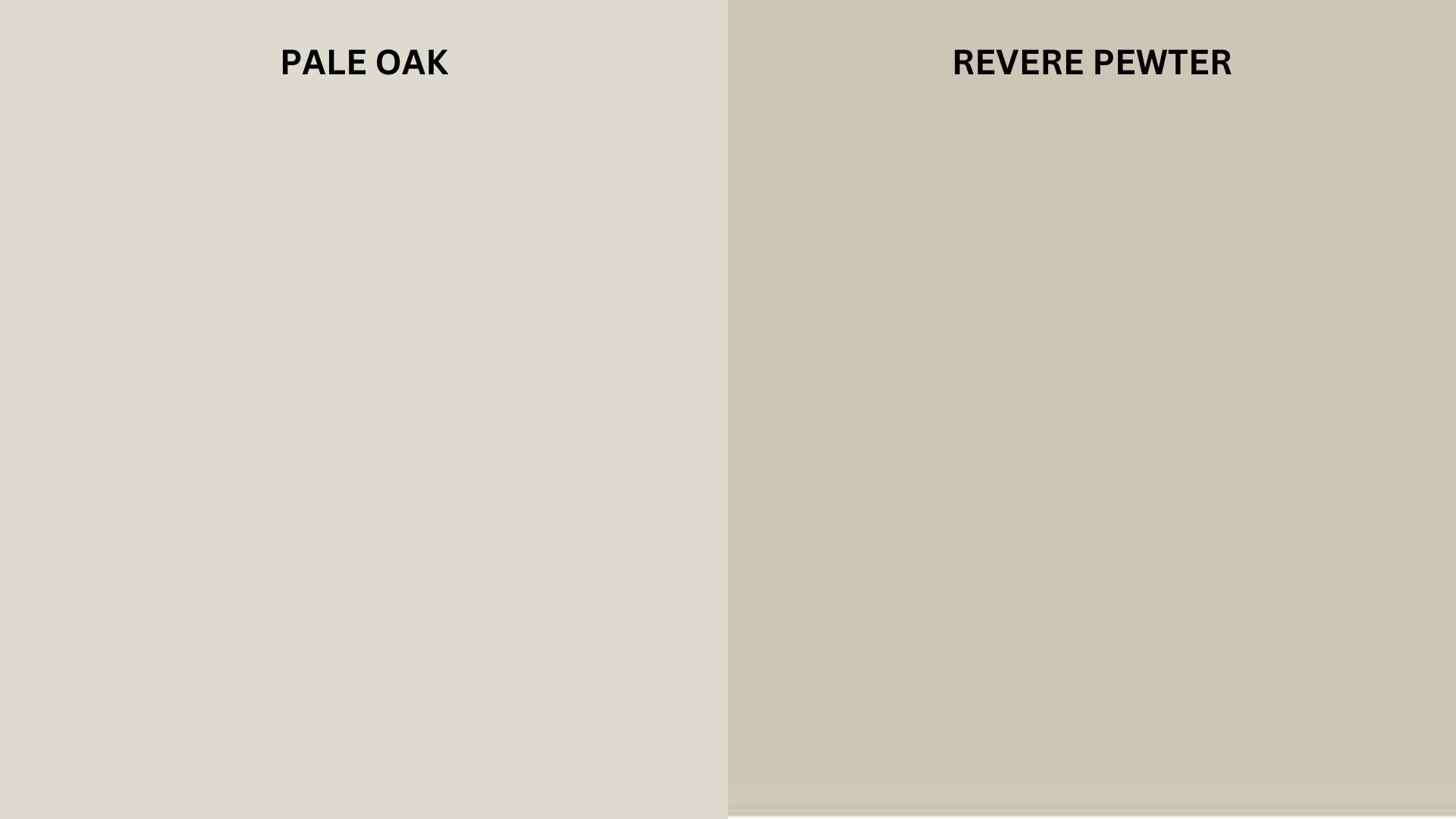
Pale Oak vs Revere Pewter Comparison Chart
When choosing between these two popular neutrals, seeing their characteristics side by side can help clarify their differences. This detailed comparison highlights how each color performs across various conditions and design scenarios:
| Feature | Pale Oak (OC-20) | Revere Pewter (HC-172) |
|---|---|---|
| LRV (Light Reflectance Value) | 68.64 | 55.05 |
| Undertones | Soft taupe with subtle green hints | Gray with green-brown undertones |
| RGB Values | R: 221, G: 217, B: 206 | R: 204, G: 196, B: 184 |
| Hue | Neutral with warm leaning | Neutral with cool leaning |
| Saturation | Low (muted) | Medium-low |
| Temperature | Warm | Balanced (slightly warm) |
| Design Style Match | Transitional, Contemporary, Modern Farmhouse | Versatile: Traditional to Modern, Craftsman |
| Morning Light Effect | Appears creamier, taupe undertones emerge | Reads true to color, gray aspects prominent |
| Evening Light Effect | Softens and warms considerably | Deepens, brown undertones become more visible |
| Trim Color Pairings | Simply White, White Dove, Chantilly Lace | White Dove, Cloud White, Decorator’s White |
| Flooring Match | Light to medium wood tones, warm tile | Medium to dark wood tones, stone, gray tile |
| Feeling Created | Airy, soft, refined, subtle | Grounded, substantial, balanced, cozy |
Pale Oak vs Revere Pewter: A Room-by-Room Comparison
How these colors perform can vary significantly depending on the specific room and its function. The following breakdown examines how each paint color behaves in different spaces throughout the home.
1. Bedroom
Different spaces have unique lighting conditions and functional requirements that can significantly impact how paint colors perform. Let’s examine how these two neutrals compare across various rooms in your home.
Pale Oak
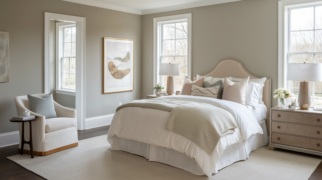
Pale Oak creates a serene, restful atmosphere in bedrooms with its soft, warm presence. Its higher LRV brightens smaller or darker bedrooms, making them feel more spacious and airy.
This color pairs beautifully with soft textiles and allows accent pieces to stand out without competition. In master suites, it creates a stylish backdrop for luxury bedding and furniture.
Revere Pewter
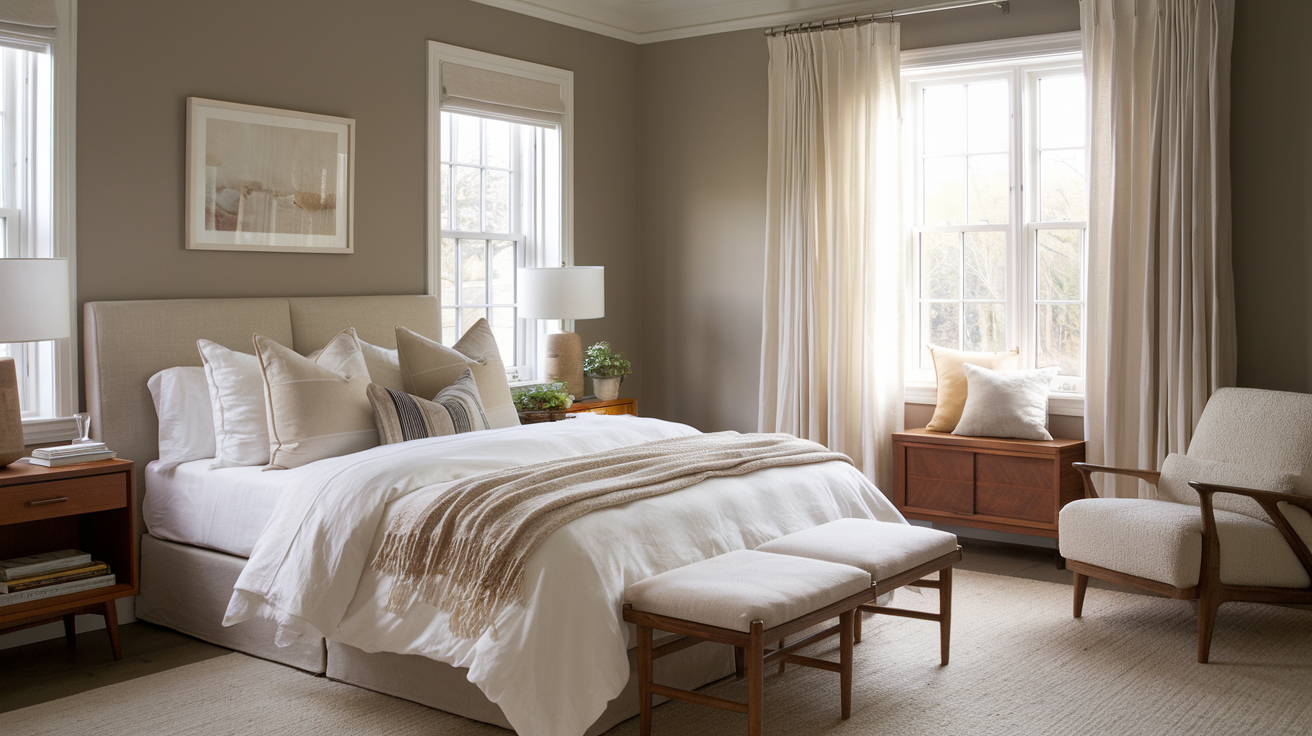
Revere Pewter provides a cocooning effect in bedrooms, offering a deeper sense of comfort and security. Its medium depth adds dimension to larger bedrooms while preventing overwhelming feelings in smaller spaces.
In bedrooms with abundant natural light, it maintains its character without washing out, making it particularly effective in rooms with southern exposure.
2. Kitchen
The kitchen requires colors that remain consistent under changing light conditions throughout the day while creating a welcoming atmosphere for this high-traffic space.
Pale Oak
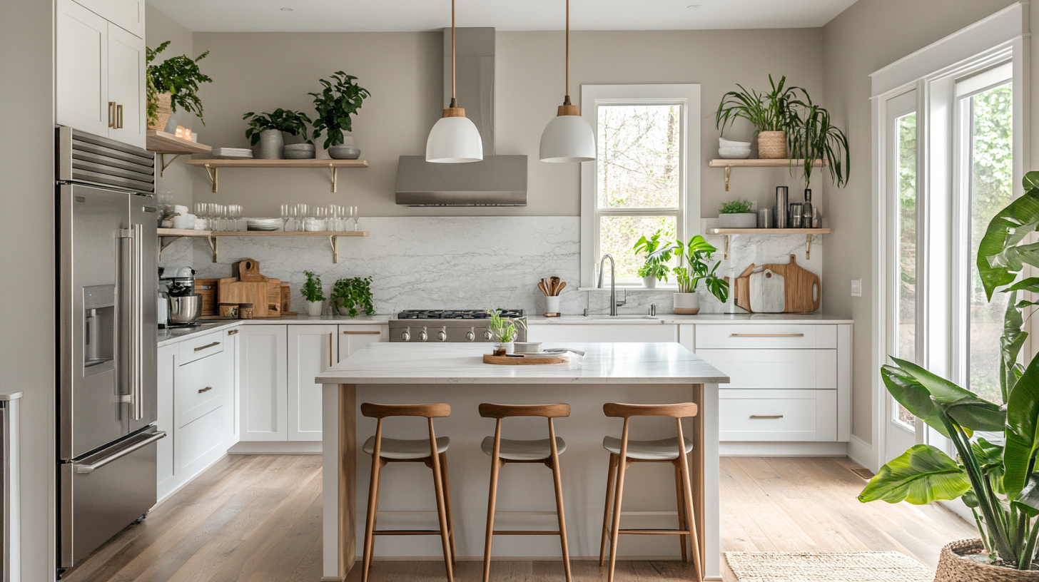
Pale Oak performs exceptionally well in kitchens, especially those with limited natural light. Its reflective quality helps brighten work areas while its warm undertones complement most cabinet finishes, from white to dark wood.
The color’s subtlety allows cabinetry, countertops, and backsplashes to remain the focal points.
Revere Pewter
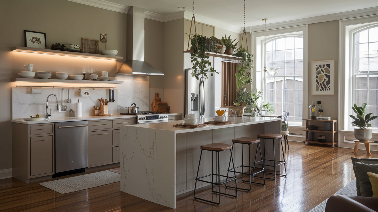
Revere Pewter grounds kitchen spaces with its substantial presence, creating a refined atmosphere that balances well with both contemporary and traditional cabinet styles.
Its depth provides excellent contrast with white cabinets and marble countertops, while harmonizing with stainless steel appliances.
3. Living Room
The living room needs versatile colors that create a cohesive backdrop for furniture and décor while establishing the desired mood for entertaining and daily living.
Pale Oak
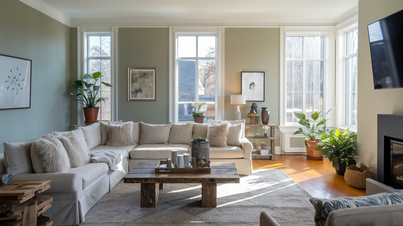
Pale Oak offers versatility in living rooms, adapting to changing light throughout the day while maintaining a consistent, welcoming atmosphere.
Its lighter value creates an expansive feeling, particularly valuable in smaller living spaces. The subtle greige tone provides enough substance to prevent walls from appearing blank or unfinished.
Revere Pewter
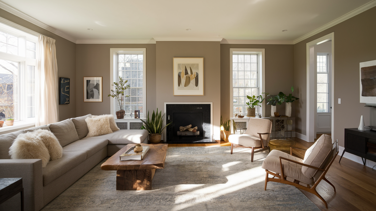
Revere Pewter creates a polished, grounded living room environment with its medium-toned presence. The color magnifies architectural features like crown molding, built-ins, and fireplaces by providing noticeable contrast with white trim.
In living rooms with high ceilings, it visually lowers the ceiling height, creating a more intimate atmosphere.
4. Bathroom
Bathrooms require colors that can withstand humidity while creating either a spa-like retreat or an energizing space, depending on the bathroom’s primary function.
Pale Oak
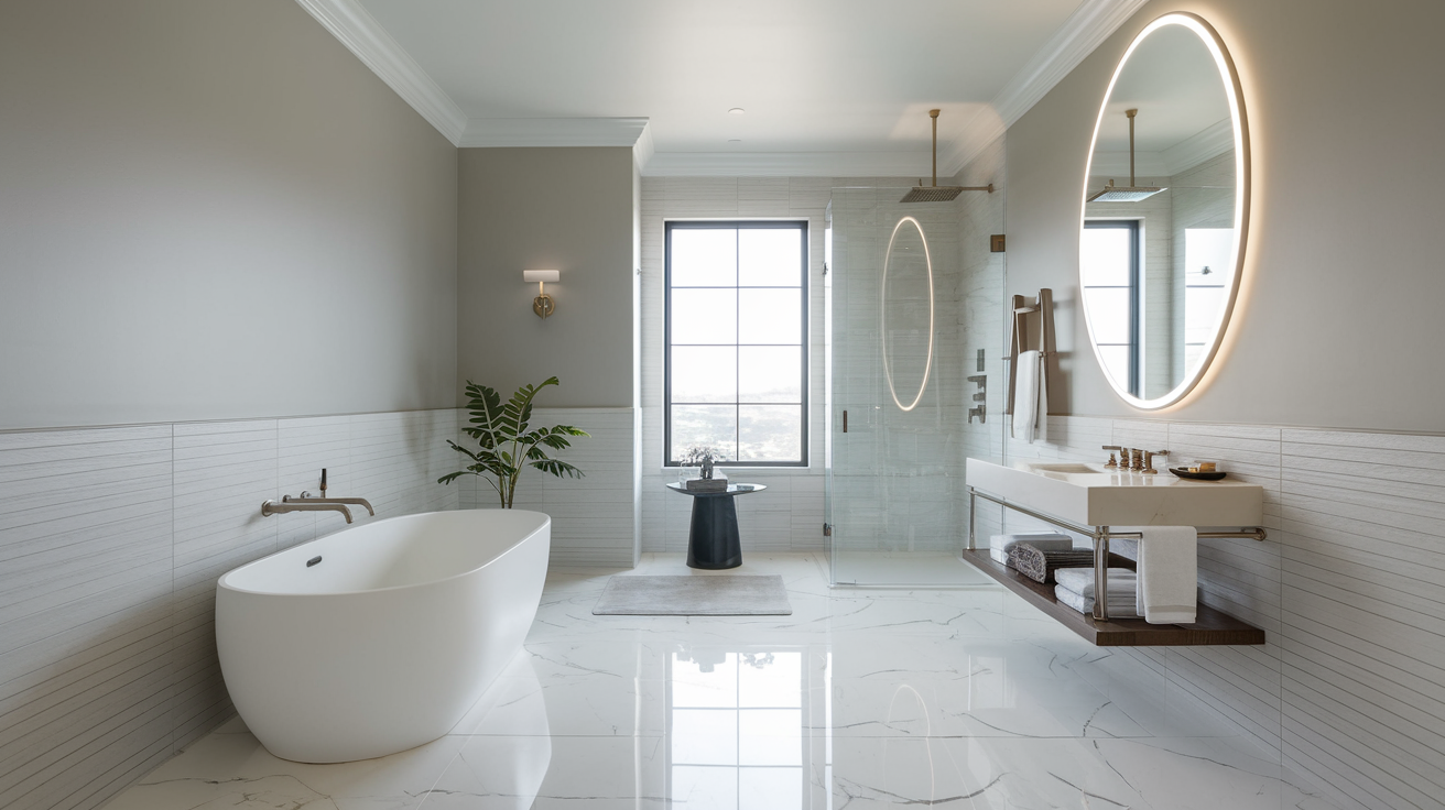
Pale Oak brings a spa-like quality to bathrooms with its soft, clean appearance. The color’s higher reflectance value maximizes limited natural light in smaller bathrooms while complementing various tile selections, particularly marble and limestone.
Its subtle warmth counteracts the coolness often found in bathroom environments without competing with other design elements.
Revere Pewter
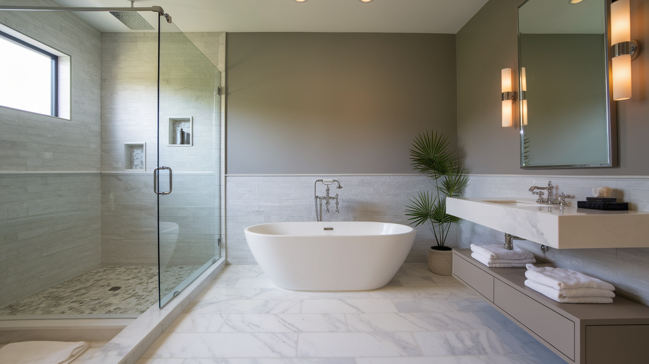
Revere Pewter creates graceful, grounded bathroom spaces with its medium depth. Its slightly cooler undertones coordinate beautifully with both cool tile choices and polished chrome fixtures.
In larger bathrooms, Revere Pewter prevents the space from feeling clinical or sterile by adding substance to expansive wall areas.
Pale Oak vs Revere Pewter: Exterior Application
While often discussed as interior colors, both Pale Oak and Revere Pewter can also serve as exterior paint options. Their performance outdoors, however, differs significantly from their interior applications.
Pale Oak appears considerably lighter on exterior surfaces, sometimes washing out in bright sunlight due to its high LRV of 68.64.
Revere Pewter with it’s medium depth (LRV 55.05) provides enough substance to define the home’s structure while remaining light enough to prevent heat absorption issues in warmer climates.
Ways to Use Pale Oak and Revere Pewter Together
The Pale Oak vs. Revere Pewter dynamic shifts from competition to collaboration when these neutrals are strategically paired within your home.
- Create Tonal Flow Between Spaces: Using Pale Oak in open areas while applying Revere Pewter in adjacent rooms establishes subtle depth progression throughout the home while maintaining cohesion.
- Establish Ceiling-Wall Relationships: Applying Pale Oak to ceilings with Revere Pewter walls creates polished dimension that enhances room height, highlighting architectural details.
- Develop Accent Wall Strategies: Using Revere Pewter as an accent against Pale Oak main walls provides depth without stark contrast, creating subtle focal points.
- Layer Trim and Wall Colors: Pairing Pale Oak trim with Revere Pewter walls (or vice versa) creates sophisticated definition around doorways and windows, emphasizing architectural elements.
- Coordinate Cabinetry and Walls: Using Pale Oak for upper cabinets with Revere Pewter for lowers creates visual height while maintaining harmony in kitchens and bathrooms.
Understanding the Pale Oak vs. Revere Pewter relationship allows you to leverage their compatibility rather than choosing between them.
The Pros and Cons of Pale Oak & Revere Pewter
In the Pale Oak vs. Revere Pewter debate, understanding each color’s strengths and limitations will guide you toward the right choice for your specific needs.
Pale Oak
| Pros | Cons |
|---|---|
| Brightens smaller spaces with high reflectance value | Can appear almost white in very bright rooms |
| Maintains consistent character across different lighting | May reveal green undertones in north-facing spaces |
| Transitions beautifully throughout the day | Requires thorough testing before committing |
| Versatile with various design styles and accent colors | Can lose subtle nuances in intense natural light |
| Creates an airy, expansive feeling | May look too plain in rooms with limited architectural features |
Revere Pewter
| Pros | Cons |
|---|---|
| Provides exceptional depth without overwhelming | Can make dark areas feel closed in |
| Effectively camouflages wall imperfections | Creates heavier atmosphere in smaller spaces |
| Requires less frequent touch-ups than lighter neutrals | May appear significantly cooler in northern exposure |
| Balanced undertones work across various lighting | Sometimes reads primarily as gray rather than greige |
| Maintains distinctive character in changing light | Can feel too conservative in very modern spaces |
The Pale Oak vs. Revere Pewter comparison ultimately comes down to your space’s specific lighting conditions, size constraints, and the atmosphere you’re trying to create.
Tips for Choosing the Perfect Neutral Color
When deciding between Pale Oak vs. Revere Pewter, consider these essential factors to ensure the optimal choice for your space.
Tip 1. Test in Your Actual Environment: Paint large sample boards and move them around the room at different times of day to observe how each color interacts with your specific lighting conditions and existing elements.
Tip 2. Consider Room Function: Evaluate the intended mood and purpose of the space, as Pale Oak creates airier atmospheres while Revere Pewter delivers more grounded, intimate feelings.
Tip 3. Account for Existing Elements: Analyze undertones in flooring, cabinetry, and permanent fixtures to ensure your chosen neutral complements rather than clashes with immovable features.
Tip 4. Think About Connected Spaces: Consider sight lines from adjoining rooms and plan thoughtful transitions if using both Pale Oak vs. Revere Pewter in neighboring areas.
Tip 5. Evaluate Natural vs. Artificial Light: Remember that both neutrals appear differently under various light sources – Pale Oak warms significantly while Revere Pewter maintains more consistent gray presence.
The Pale Oak vs. Revere Pewter decision becomes much clearer when you methodically consider these specific aspects of your unique space.
The Bottom Line
Choosing between Pale Oak and Revere Pewter ultimately depends on your space, lighting conditions, and design goals.
Pale Oak offers an airy, subtle backdrop that brightens spaces while maintaining warmth, making it ideal for smaller rooms or areas with limited natural light. Revere Pewter provides more substance and depth, creating a polished, grounded feeling that works beautifully in well-lit spaces where you want a more defined presence.
Remember that paint colors are deeply influenced by their environment, hence what works in one home may read differently in yours. Take time to test samples in your specific lighting conditions before making your final decision.
Need more help with your paint selection? Check out our other comparison guides for popular neutrals. Or leave a comment below with your questions about these colors – I’m happy to help you find your perfect paint match!