I’ve seen countless homeowners struggle when choosing between Iron Ore and Tricorn Black. These popular Sherwin-Williams dark neutrals look similar at first glance, but they perform quite differently once applied to walls.
In my years working with these colors, I’ve noticed how lighting, room dimensions, and even the time of day dramatically transform these shades.
Iron Ore might look perfect in a paint store, but completely different in a basement setting. And Tricorn Black presents even more variables. Many of my clients get stuck on this decision, and I understand why.
The right choice can concert a space completely, while the wrong one can lead to disappointment. I’m excited to share what truly sets these colors apart and how you can select the perfect dark neutral for your specific space.
Iron Ore vs. Tricorn Black: Which Deep Hue Is Right for Your Space
This table highlights the key differences and unique qualities of Sherwin-Williams’ Iron Ore and Tricorn Black.
Whether you’re looking for a softer charcoal or a bold, true black, this comparison will help you decide which color best suits your design needs.
| Feature | Iron Ore (SW 7069) | Tricorn Black (SW 6258) |
|---|---|---|
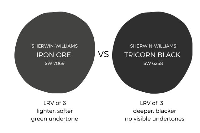
| Color Description | Rich, deep charcoal with a balance between black and dark gray. | True, deep black with no undertones. |
| Light Reflectance Value (LRV) | 6 – Lighter than pure black but still dramatic. | 2.4 to 3 – Absorbs almost all light for a bold effect. |
| Undertones | Subtle undertones that can be warm or cool, depending on light and materials. | No visible undertones; remains a pure black. |
| Lighting Effects | In natural light, it may show hints of blue or green; in lower light, it leans toward a soft charcoal. | Does not shift in different lighting; it stays true black. |
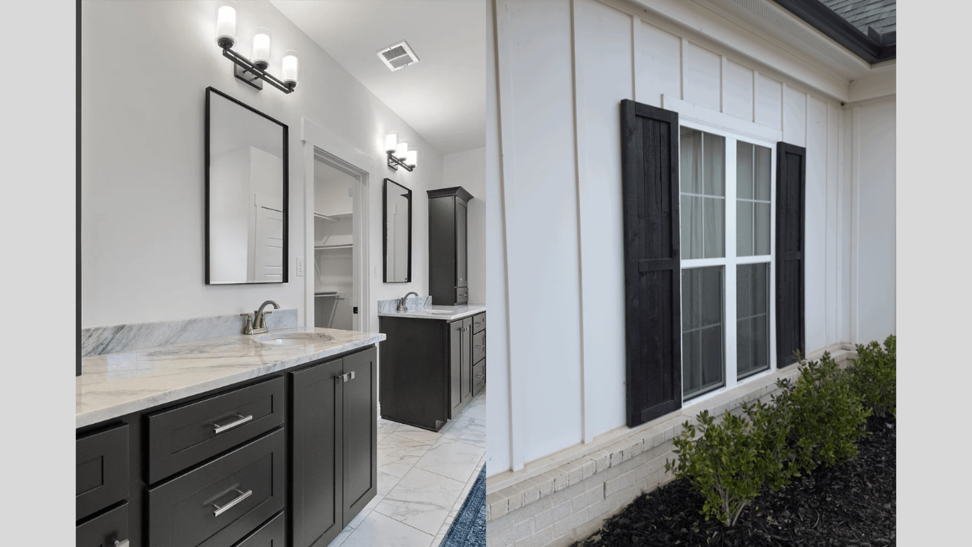
| Best Use Cases | Works well for accent walls, cabinetry, exteriors, and trim. | Ideal for high-contrast accents, trim, doors, cabinetry, and dramatic accent walls. |
| Pairing Options | Pairs well with whites, warm wood tones, and muted neutrals. | Pairs with both warm and cool palettes, whites, earth tones, and metallics. |
| Vibe | Versatile, sophisticated, warm, and approachable. | Bold, dramatic, and timeless. |
| Suitability | Great for modern and traditional spaces, adding a cozy, sophisticated feel. | Perfect for both modern and classic designs, especially for creating striking backdrops. |
| Finish | Adds depth without overpowering the space, soft and adaptable. | Excellent coverage and durability, hides imperfections well. |
| Unique Qualities | A softer alternative to pure black, adaptable in various lighting conditions. | The ultimate true black, known for its dramatic impact and striking contrast. |
Iron Ore vs. Tricorn Black: Which Dark Neutral Makes the Bigger Impact?
Iron Ore appears as a soft charcoal with blue-gray undertones, creating depth without absorbing all available light.
Tricorn Black is a true black with minimal undertones. It absorbs 97% of light, making it ideal for media rooms but challenging in poorly lit spaces. It requires significantly more lighting—at least 6-8 sources per room—to prevent a cave-like effect.
For most basements, Iron Ore delivers better real-world performance. Its slightly higher LRV reveals more dimension and texture, particularly on textured walls. It pairs easily with other colors without creating harsh transitions.
Tricorn Black excels as an accent color on feature walls, built-ins, or media room walls where its light-absorbing properties enhance screen viewing. It creates maximum contrast with white trim and light furnishings.
The final choice comes down to how dramatic you want your space to feel and how much light your basement receives. For a softer, more versatile dark that still makes a statement, Iron Ore wins. For maximum drama and contrast in well-lit areas, Tricorn Black takes the prize.
Color Companions for Iron Ore: Shades That Shine Alongside
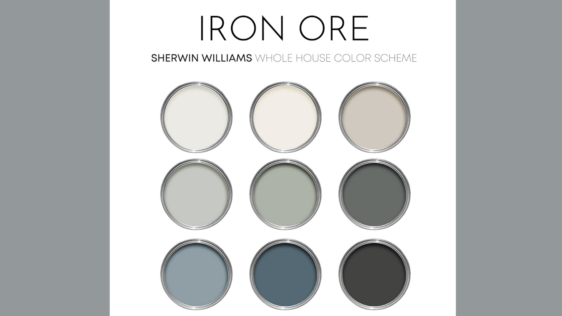
Iron Ore (SW 7069) creates a perfect backdrop for many color pairings in basement settings. This deep charcoal with its LRV of 6 offers more flexibility than true blacks while still providing dramatic impact.
- Crisp Whites: White paints like Alabaster (SW 7008) and Pure White (SW 7005) create sharp, clean contrast with Iron Ore.
- Warm Neutrals: Accessible Beige (SW 7036) and Agreeable Gray (SW 7029) soften the edge of Iron Ore while maintaining a sophisticated look.
- Light Blues: For a modern approach, light blues with gray undertones like Sea Salt (SW 6204) pair surprisingly well with Iron Ore. The subtle blue notes in Iron Ore connect with these lighter blues without clashing.
- Metallic Accents: Metallic accents make Iron Ore truly shine. Brass and gold fixtures pop dramatically against this dark neutral, adding warmth and light reflection. Silver and chrome create a cooler, more contemporary effect against Iron Ore’s depth.
- Gray Companions: If using Iron Ore on all walls feels too heavy, consider an accent wall paired with Repose Gray (SW 7015) or Mindful Gray (SW 7016) on remaining walls.
- Natural Wood Tones: Natural wood tones, particularly medium to light woods, create beautiful balance with Iron Ore’s depth. The natural warmth of wood prevents the space from feeling too monochromatic or cold.
When combining these colors with Iron Ore in basements, lighting remains key. Each additional light source helps reveal the rich complexity of these color combinations and prevents Iron Ore from absorbing too much light.
Tricorn Black’s Best Matches: Colors That Make It Pop
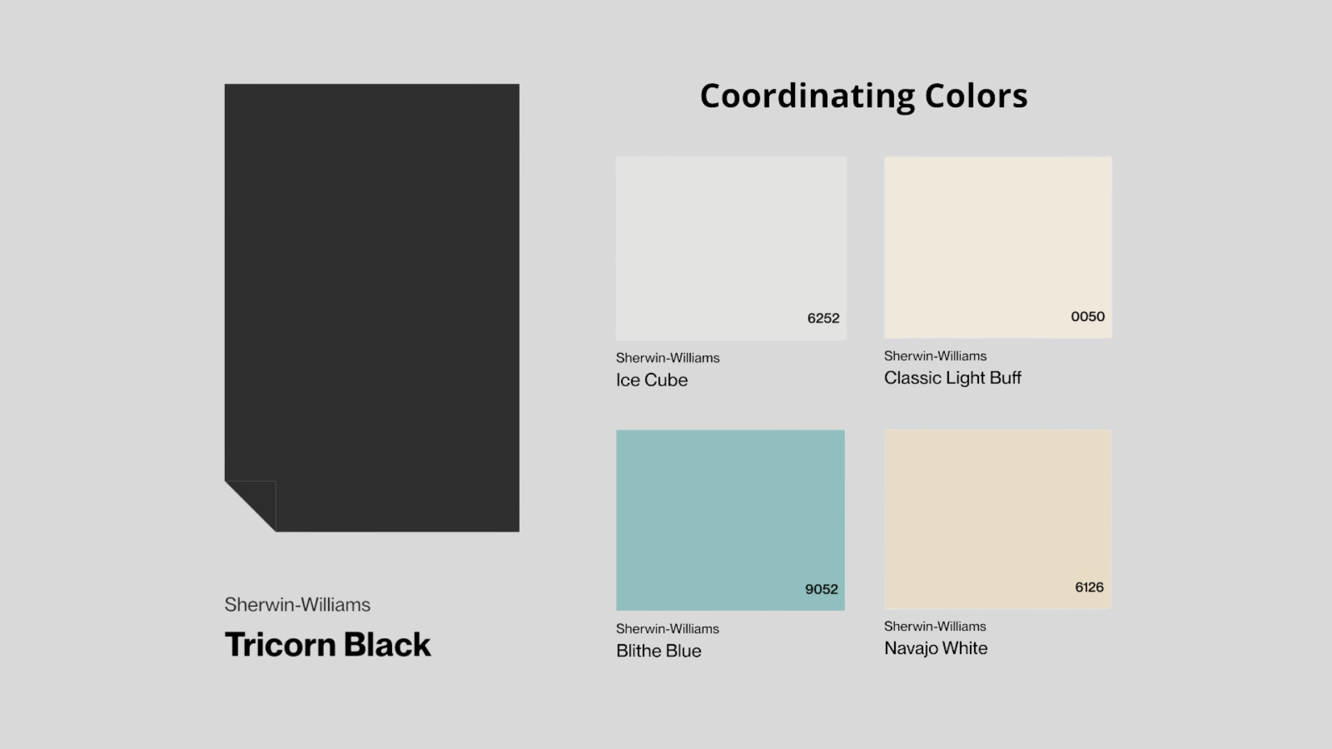
Tricorn Black (SW 6258) with its ultra-low LRV of 3 creates dramatic statements in basement spaces. This true black absorbs nearly all light, making complementary color choices especially important for balance and visual interest.
- Pure Whites: Extra White (SW 7006) and High Reflectance White (SW 7757) create maximum contrast with Tricorn Black. These whites have high LRVs (85+) that help reflect light throughout the space, balancing Tricorn’s light-absorbing properties.
- Soft Whites: Greek Villa (SW 7551) and Alabaster (SW 7008) offer slightly warmer whites that soften the stark contrast with Tricorn Black. These whites create a more livable contrast while still maintaining the dramatic effect of the black.
- Greiges: Accessible Beige (SW 7036) and Amazing Gray (SW 7044) provide sophisticated neutrals that work well with Tricorn Black.
- Vibrant Accents: Tricorn Black makes vibrant colors pop dramatically. Coral colors like Ardent Coral (SW 6874) or blues like Impromptu (SW 6968) stand out brilliantly against this true black backdrop.
- Metallics: Gold, brass, and copper accents create a luxurious, warm contrast against Tricorn Black. These warm metallics visually lighten the heaviness of the black while adding dimensional interest.
- Natural Elements: Light woods, especially blonde oak and maple, provide excellent visual relief against Tricorn Black. The natural warmth of wood prevents the space from feeling too cold or stark.
Tricorn Black requires significant lighting support in basements—aim for twice the lighting you’d normally use. Consider using Tricorn Black as an accent rather than for all walls in basement spaces with limited natural light.
How to Decide Between Iron Ore vs Tricorn Black
Can’t choose between Iron Ore and Tricorn Black for your basement? Let me help you pick the right dark color for your space. Both are popular dark paints, but they work differently in basements.
Key Differences You Can See
- Color Depth: Iron Ore (SW 7069) is a dark charcoal gray. Tricorn Black (SW 6258) is a true, deep black.
- Light Reflection: Iron Ore has an LRV of 6, reflecting 6% of light. Tricorn Black has an LRV of 3, reflecting only 3% of light.
- Undertones: Iron Ore shows slight blue-gray undertones. Tricorn Black has almost no undertones.
When to Choose Iron Ore
Iron Ore works best when:
- Your basement has limited lighting
- You want a softer, dark color
- You need a bit more light reflection
- You prefer a dark gray over true black
- You plan to paint all the walls the same color
Iron Ore looks great with whites like Alabaster (SW 7008) and warm woods. The slight blue-gray tones make it mix well with many colors.
When to Choose Tricorn Black
Tricorn Black works best when:
- Your basement has plenty of lighting
- You want the boldest, dark look
- You’re painting just one accent wall
- You’re creating a media room
- You want a sharp contrast with white trim
Tricorn Black pairs well with Extra White (SW 7006) and bright accent colors. It creates a more dramatic, modern look.
Simple Test to Decide
Paint a 2×2-foot square of each color on your basement walls. Look at them:
- In the morning
- At noon
- In the evening, with lights on
The color that looks best across different times is your winner.
Iron Ore vs. Tricorn Black – An Interior Designer’s Take
As an interior designer who’s used both colors extensively, the differences between these popular dark shades matter significantly in real-world applications.
Iron Ore (SW 7069) is a deep charcoal with subtle blue-gray undertones and an LRV of 6. It reflects more light, shows more dimension, and appears softer than true black. Iron Ore works well in spaces with limited lighting and pairs beautifully with warm woods and brass.
Tricorn Black (SW 6258) is a true, neutral black with minimal undertones and an LRV of 3. It creates maximum contrast, absorbs more light, and delivers a cleaner, more modern look. Tricorn requires excellent lighting but creates unmatched drama.
For most basements, Iron Ore proves more practical due to its higher light reflection. For media rooms or accent walls where you want maximum impact, Tricorn Black excels.
Both need to be tested in your specific space, as existing lighting dramatically affects how they appear.
The Bottom Line
I’ve found that both Iron Ore and Tricorn Black offer striking options for basement walls, but they serve different needs.
In my experience, Iron Ore provides more forgiveness with its higher LRV of 6 and blue-gray undertones, making it ideal for spaces with limited lighting. I’ve seen Tricorn Black deliver maximum drama with its true black appearance and LRV of 3, perfect for accent walls or media rooms.
I strongly recommend you test large samples of both colors in your actual basement lighting before deciding. The color that looks best across different times of day is your winner.
Ready to convert your basement? Start with sample pots today. And if you’ve already used either color in your home, I’d love to hear about your experience in the comments below!